Dana Tanamachi is an influential typographer
TYPE →
CONTEMPORARY
DESIGN
Dana Tanamachi is an influential lettering artist and graphic designer who helped demonstrate the possibilities of handmade typography within the contemporary design space. She started her work with hand-lettering during a period when digital tools had become the main focal point of the design process. Despite this challenge, she developed a practice that involved drawing letters by hand. Instead of treating lettering as a method of writing words, Tanamachi looks at letterforms as visual objects that can communicate strong messages and contribute to entire compositions. With that said, her craft combines custom type, illustration, and large-scale installations, allowing lettering to function in both graphic and physical environments (Tanamachi Studio, n.d.). Tanamachi’s influence also stems from the way she combines her knowledge of typography with influences from traditional lettering and design. Her formal education in communication design introduced her to typography and composition, while her work experience at SpotCo exposed her to a variety of historical lettering styles through Broadway poster design. She later worked under designer Louise Fili, whose approach to typography and package design further influenced her approach to detailed and expressive typography (AIGA Houston, 2012; Tanamachi Studio, n.d.). These experiences helped shape a practice that draws from historical typography while reinterpreting it through contemporary hand-lettering. Tanamachi incorporates influences from Victorian ornamentation, Art Nouveau, and Art Deco, along with illustration, pattern, and craft, into her lettering practice (Tanamachi Studio, n.d.).

Lettering artist, graphic designer, and educator known for custom hand-lettering and chalk murals.
A Brooklyn housewarming mural became the beginning of Tanamachi's professional chalk practice.
A physical medium that allowed her to practice constructing letters by hand.
Letterforms are created specifically for the message, composition, and environment.
Tanamachi’s work became more influential after a casual experiment with chalk developed into a professional lettering practice. In 2009, she was invited to a housewarming party in Brooklyn, where she created a large chalk mural for fun. When pictures of her work were shared online, she was requested for professional commissions from companies such as Google. As a result, large-scale chalk lettering became a central part of her artistic practice (AIGA Houston, 2012). The attention surrounding her work proved that a traditional, hand-drawn lettering technique could still attract modern-day audiences and function within professional graphic design. Tanamachi’s ability to transform an “informal” art practice into an approach that is recognized in the professional contemporary design world is what makes her so influential. In an interview with AIGA, she talks about how she continues to use basic materials such as chalk, an old rag, and a sewing tape measure, or really anything that she can find laying around. She also avoids using projectors for her chalk installations as she believes that working this way will help her maintain the physical process and preserve the character of her work (AIGA Houston, 2012).
Tanamachi’s influence extends beyond the popularity of chalk lettering. More importantly, she has demonstrated how handmade typography can remain relevant within contemporary graphic design. Her work brings together historical influences, craft traditions, illustration, and modern design practices (Tanamachi Studio, n.d.).
Dana Tanamachi's most significant contribution to the field of typography
BECOMES
DESIGN
The most significant contribution Dana Tanamachi made to typography is her demonstration that handmade lettering can function as a contemporary design practice rather than simply as a traditional craft. Her work helped create a space where physical lettering, illustration, and graphic design could exist together. Instead of relying on an existing typeface and applying it to a design, Tanamachi creates custom letterforms that respond to the specific message, composition, and environment in which they will appear. Her practice demonstrates the value of designing typography specifically for its context, showing how letterforms can be adapted to strengthen the relationship between the message, medium, and visual environment. This approach is important because lettering and typeface design operate differently. A typeface is generally designed as a system of reusable characters, while custom lettering can be created specifically for a particular word or composition. Tanamachi’s practice takes advantage of this flexibility. Her studio specializes in custom typography and illustration, allowing the letterforms themselves to become part of the visual identity of a project (Tanamachi Studio, n.d.).
Designed specifically for a particular word, message, or composition.
Chalk preserves texture, pressure, movement, and imperfection.
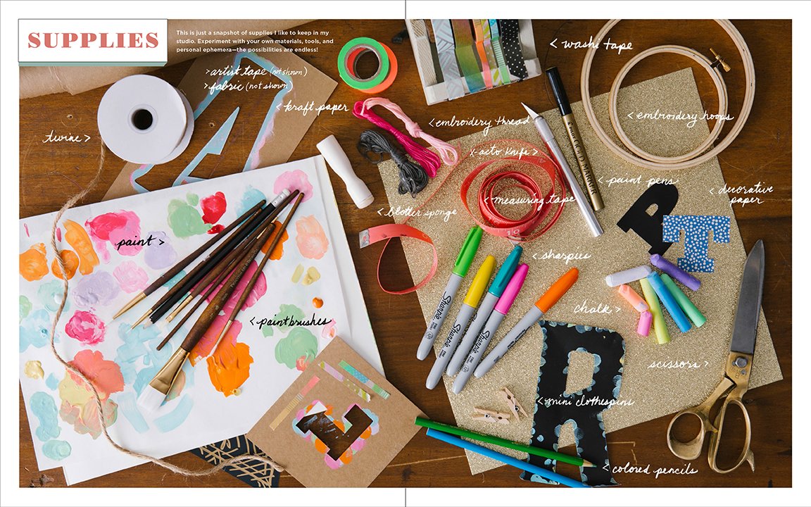
DIY Type encourages people to experiment with lettering themselves.
Furthermore, her use of chalk made this approach particularly recognizable. Tanamachi did not select chalk simply because it looked nostalgic, but because she was looking for a medium that would allow her to create type from scratch. When Tanamachi felt that her lettering skills were starting to weaken due to focusing on existing client work for Louise Fili, chalk gave her the opportunity to practice constructing letters physically (AIGA Houston, 2012). As a result, Tanamachi’s work with chalk challenged the expectation that typography needed to be perfect. Since Tanamachi draws her letters directly onto a surface, you could still see the evidence of the physical process in the final work. The variations in texture, pressure, spacing, and line quality become part of the finished design. Instead of correcting these qualities to make the work appear digitally perfect, she allows them to contribute to its character. Tanamachi also shared this approach through her book, DIY Type, which provides alphabet stencils that people can use to create their own lettering and designs. The book encourages people to experiment with handmade typography and appreciate the small imperfections that come from creating letters by hand (Penguin Random House, 2014). This extends Tanamachi’s approach beyond her own professional practice by giving others the opportunity to experiment with lettering themselves.
Tanamachi’s most significant contribution is therefore not simply that she helped make chalk lettering popular. More importantly, she demonstrated how physical craft, custom lettering, and contemporary graphic design can work together. Her practice gives typography a sense of materiality and individuality while still treating it as a professional form of visual communication. By making lettering more approachable, DIY Type also reduces the pressure to create perfectly polished work and encourages beginners to experiment with typography themselves.
What this contribution inspired in the field of typography
IS
RELEVANT
A chalk mural created for a Brooklyn housewarming party begins attracting attention beyond her immediate community.
Photographs of Tanamachi's work spread online and lead to professional commissions.
Handmade typography becomes a recognizable part of contemporary graphic design, illustration, packaging, and environmental work.
Tanamachi’s contribution has influenced contemporary typography by increasing the visibility and perceived relevance of handmade lettering. Her work demonstrated that drawing letters by hand could be more than a personal hobby or traditional sign-making technique. It could become the foundation of a professional design practice and could be applied to murals, editorial work, packaging, installations, and other forms of visual communication (Tanamachi Studio, n.d.). Her 2009 chalk mural is particularly important to this influence. What began as an informal project within her Brooklyn community developed through photographs and social media into professional commissions. Tanamachi has explained that she spent approximately a year creating these chalk pieces simply for friends before the work began attracting wider attention (AIGA Houston, 2012). The One Club for Creativity similarly identifies the 2009 installation as the event that helped set the chalk-lettering trend and her career in motion (The One Club for Creativity, n.d.).
The influence of her work can also be understood through its emphasis on individuality and imperfection. Contemporary digital design makes it easy to reproduce the same letterforms consistently. Tanamachi’s work offers a different visual experience because the physical process remains visible. The slight irregularities in handmade lettering can make a design feel personal and approachable rather than mechanically produced. Her DIY Type project takes this idea further by encouraging people to create their own compositions and embrace the imperfections produced by the process (Penguin Random House, 2014). Her work has also encouraged a broader understanding of what typography can do within a composition. Tanamachi’s lettering is often closely connected to illustration, ornament, pattern, and physical space. Her own description of her influences includes Art Nouveau, Art Deco, Victorian ornamentation, illustration, and patterns, as well as craft traditions from different cultures (Tanamachi Studio, n.d.).
This combination of typography and craft has helped make lettering feel less restricted to the page or screen. It invites the idea that a large-scale typographic mural can become part of an environment, while a hand-lettered package or editorial piece can give any written message a distinct visual personality. Therefore, Tanamachi’s work contributes to a movement toward customization and expression in typography. Ultimately, Tanamachi’s influence lies in showing that handmade and contemporary design do not have to be opposing approaches. Her practice demonstrates how traditional techniques can be reinterpreted through contemporary graphic design and that the physical qualities of handmade lettering can be used to tell an effective story.
Analysis of a lettering work designed by Dana Tanamachi
RHYTHM
SPACE
Dana Tanamachi is primarily known as a lettering artist and designer rather than a traditional typeface designer. Her work focuses on creating custom lettering for specific projects and environments (The One Club for Creativity, n.d.; Tanamachi Studio, n.d.). For this analysis, Bloomingdale’s Little Registry Guide for Brides is a useful example of her custom lettering because it shows how she combines decorative details with readable letterforms. The lettering has a strong balance between structure and decoration. The letters remain easy to recognize, while the added flourishes and decorative elements give them a more expressive appearance. Rather than allowing the decoration to overpower the words, Tanamachi uses it to enhance the letterforms and give the typography a distinct visual style.
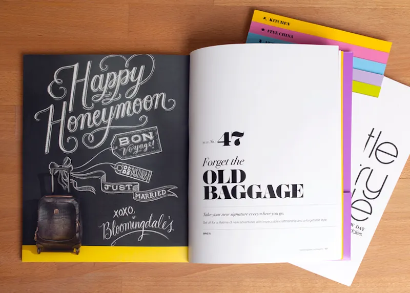
Curved strokes and flourishes create movement throughout the lettering.
Repeated shapes and curves connect individual letters into a consistent system.
Positive and negative spaces prevent the decorative elements from becoming overwhelming.
The lettering also shows Tanamachi’s use of stroke, rhythm, and spacing. The curved strokes and flourishes create movement throughout the lettering, while the more structured parts of the letters help maintain readability. Similar shapes and curves are repeated throughout the design, which makes the individual letters feel connected and consistent. The positive and negative spaces within and between the letters also contribute to the overall rhythm. These spaces prevent the lettering from feeling too crowded and allow the decorative elements to exist without making the words difficult to read. The handmade quality of the lettering is another important feature. Rather than appearing completely uniform, the lines have subtle variations that make the work feel more personal and tactile. This reflects Tanamachi’s preference for maintaining the physical qualities of the lettering process (AIGA Houston, 2012).
The visual style of the lettering also connects to Tanamachi’s interest in historical typography. She identifies Victorian ornamentation, Art Nouveau, and Art Deco as influences, along with illustration, patterns, and craft traditions (Tanamachi Studio, n.d.). These influences can be seen in the decorative quality and detailed forms of the lettering in Little Registry Guide for Brides. However, the lettering does not simply function as decoration. It remains readable while adding personality to the publication and helping establish its visual character. Overall, Tanamachi’s lettering in this work is effective because it balances readability, decoration, rhythm, spacing, and handmade texture. The letters communicate information while also functioning as visual elements that contribute to the overall identity of the guide.
Analysis of a typographic composition by Dana Tanamachi
BECOMES
SPACE
One example of Tanamachi’s approach to typographic composition is her Ace Hotel and Martin Greenfield Clothiers installation, which demonstrates how her lettering can respond to both a subject and a physical environment. The project combines custom chalk lettering with imagery and themes associated with tailoring and craftsmanship. The composition is effective because the typography does not appear to have been treated as an isolated block of text. Instead, the lettering and decorative elements work together as a single visual system. The forms that represent needles and threads surrounding the words help connect the typography to the theme of tailoring, creating a relationship between the written message and the subject of the installation.
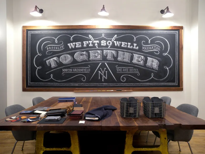
Differences in scale create a clear entry point and guide the viewer through the design.
Repeated curves, flourishes, and line work connect separate areas of the composition.
Bright chalk against the dark surface makes the typography visually prominent.
Hierarchy is established through differences in scale and visual emphasis. The larger lettering immediately attracts attention and provides an entry point into the composition. Smaller details can then be discovered as the viewer looks more closely. Altogether, it creates a layered experience rather than giving equal importance to every element. The composition also relies heavily on rhythm and repetition. The repetition of curves, flourishes, and line art guides the viewer’s eye across the surface. The repeated visual language helps connect separate areas of the composition. This creates unity and prevents the large amount of information from feeling disconnected.
The chalk medium contributes another layer to the composition. Since the lettering is drawn directly onto a dark surface, the contrast between the chalk and background makes the typography visually prominent. At the same time, the texture of the chalk prevents the lettering from appearing completely flat or mechanical. Tanamachi has described chalk as a medium she values partly because of its physical and temporary qualities (Essmaker, 2012). Overall, the Ace Hotel installation demonstrates how Tanamachi uses hierarchy, scale, rhythm, ornament, contrast, and materiality to turn lettering into an environmental experience. The typography communicates information, but it also contributes to the atmosphere and identity of the space. Rather than simply placing text onto a surface, Tanamachi makes the lettering itself part of the environment.
References
AIGA Houston. (2012, August 17). 5 questions: Dana Tanamachi. https://houston.aiga.org/dana_tanamachi/
Essmaker, T. (2012, March 20). Dana Tanamachi. The Great Discontent. https://thegreatdiscontent.com/interview/dana-tanamachi/
Penguin Random House. (2014, September 30). DIY Type: 50+ typographic stencils for decorating, crafting, and gifting. https://www.penguinrandomhouse.com/books/237772/diy-type-by-dana-tanamachi/
Tanamachi, D. (2014). DIY type: 50+ typographic stencils for decorating, crafting, and gifting. Potter Style.
Tanamachi, D. (n.d.). Bloomies [Illustration]. Dribbble. https://dribbble.com/shots/655504-Bloomies
Tanamachi Studio. (n.d.). About. https://tanamachistudio.com/about
The One Club for Creativity. (n.d.). Dana Tanamachi | Young Guns 9. https://www.oneclub.org/awards/youngguns/-award/61668/dana-tanamachi/
Type Directors Club. (2014, July 25). TDC sponsors Dana Tanamachi at TypeCon2014. https://archive.tdc.org/news/tdc-sponsors-dana-tanamachi/
AI ASSISTANCE
OpenAI's ChatGPT was used to assist with troubleshooting and refining the HTML and CSS of this website, including adjustments to PNG navigation sizing, element sizing, and grid layout issues.
OpenAI. (2026). ChatGPT (GPT-5.6 Luna) [Large language model]. https://chatgpt.com/